Redesigning a portal built for
complexity, and customers
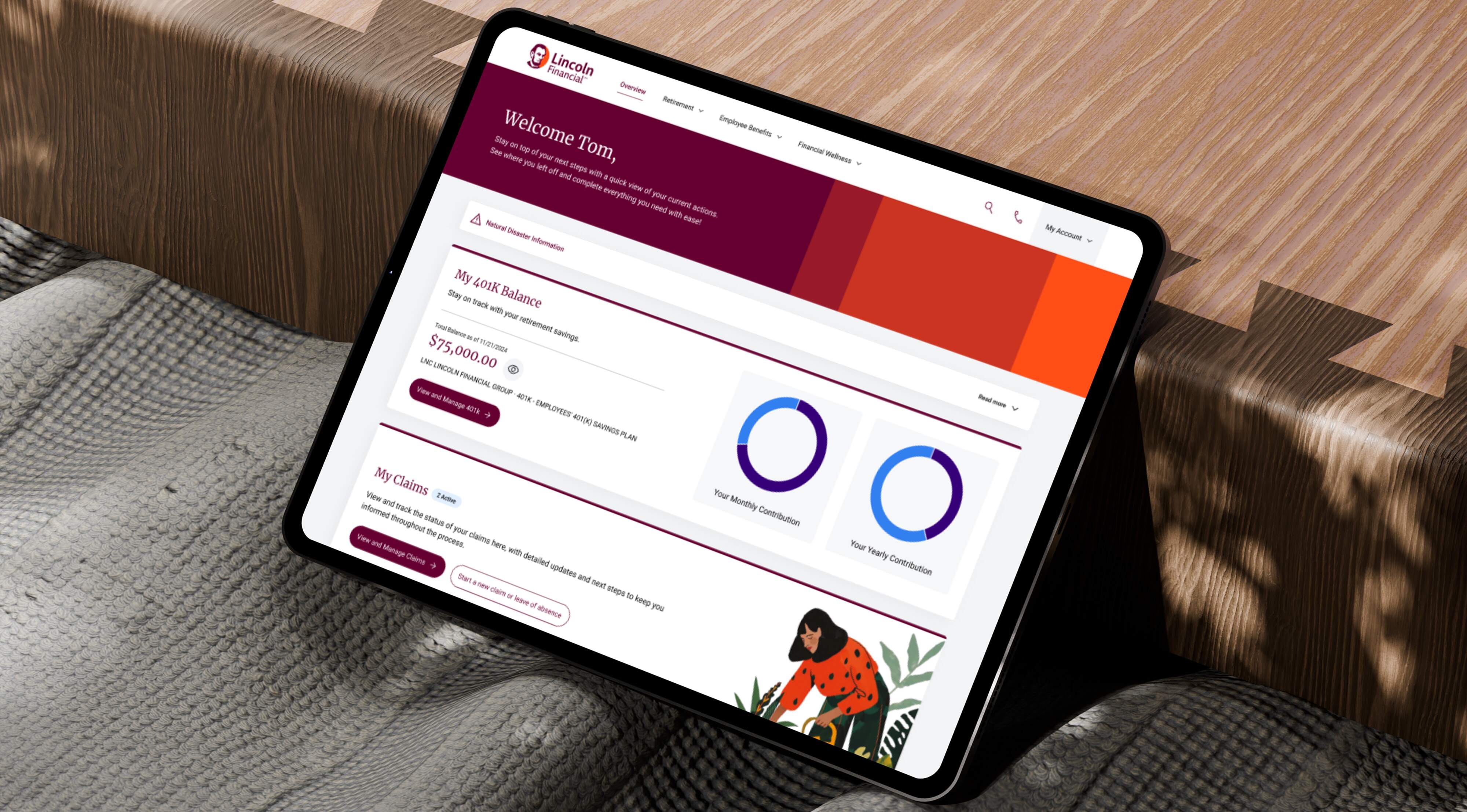
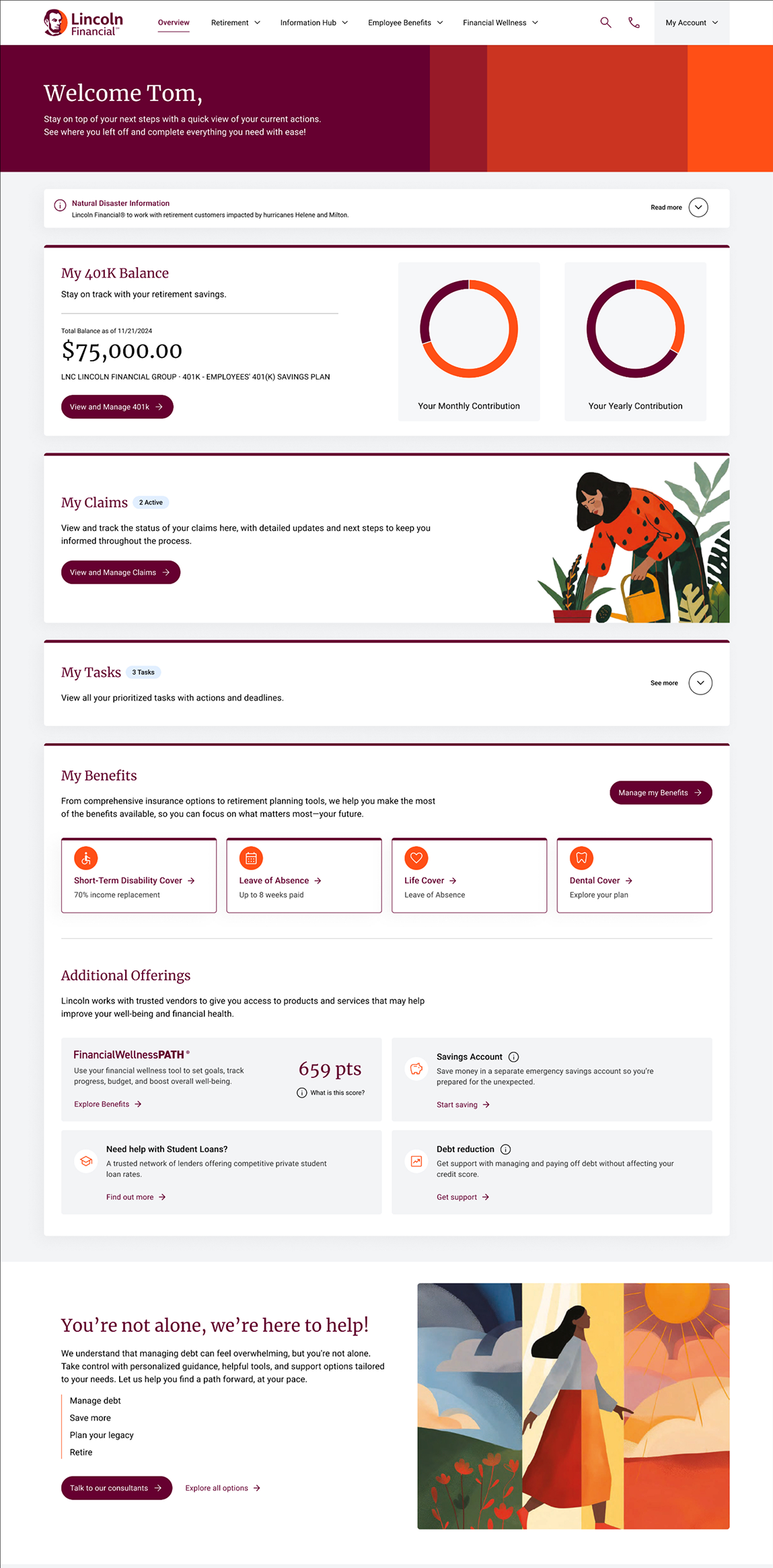
Lincoln Financial's customer portal had become a maze of inconsistent patterns and outdated interactions. I led the navigation and dashboard redesign — streamlining task flows, modernising the interface, and achieving a 45% increase in task completion efficiency
About the Company
Lincoln Financial is a U.S. financial services company helping individuals and families plan, protect, and retire with confidence. Their offerings span life insurance, annuities, retirement plans, and group protection products — with a brand legacy built on integrity and long-term commitment to customers.
Over time, their customer portal had accumulated complexity without cohesion. What should have been a confident, empowering experience had become fragmented — forcing users to work harder than they should to access the tools and information they needed most.
Context
The business challenge
The portal needed to reflect the quality and trustworthiness of the Lincoln Financial brand — while meaningfully improving users' ability to manage policies, check retirement plans, and access account information without relying on customer support.
My involvement
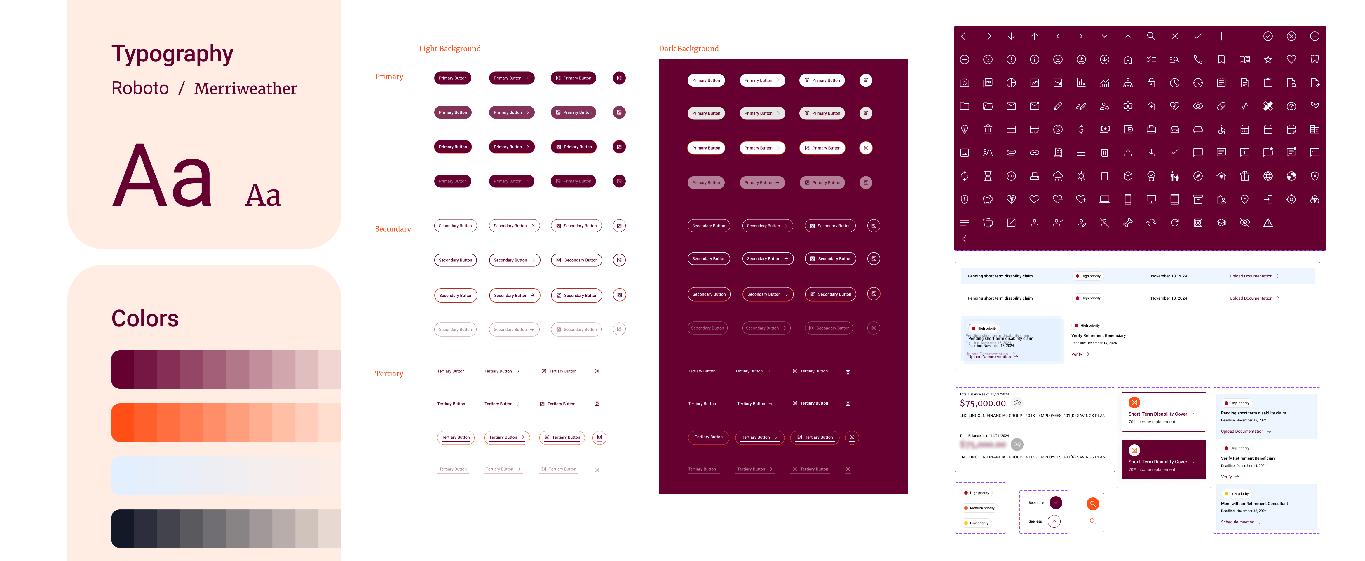
I led the UX and visual design effort: conducting the design audit, synthesising research, defining the new interaction patterns, building the Digital Style Guide in Figma, and delivering a fully tested high-fidelity design ready for development handoff.
The research
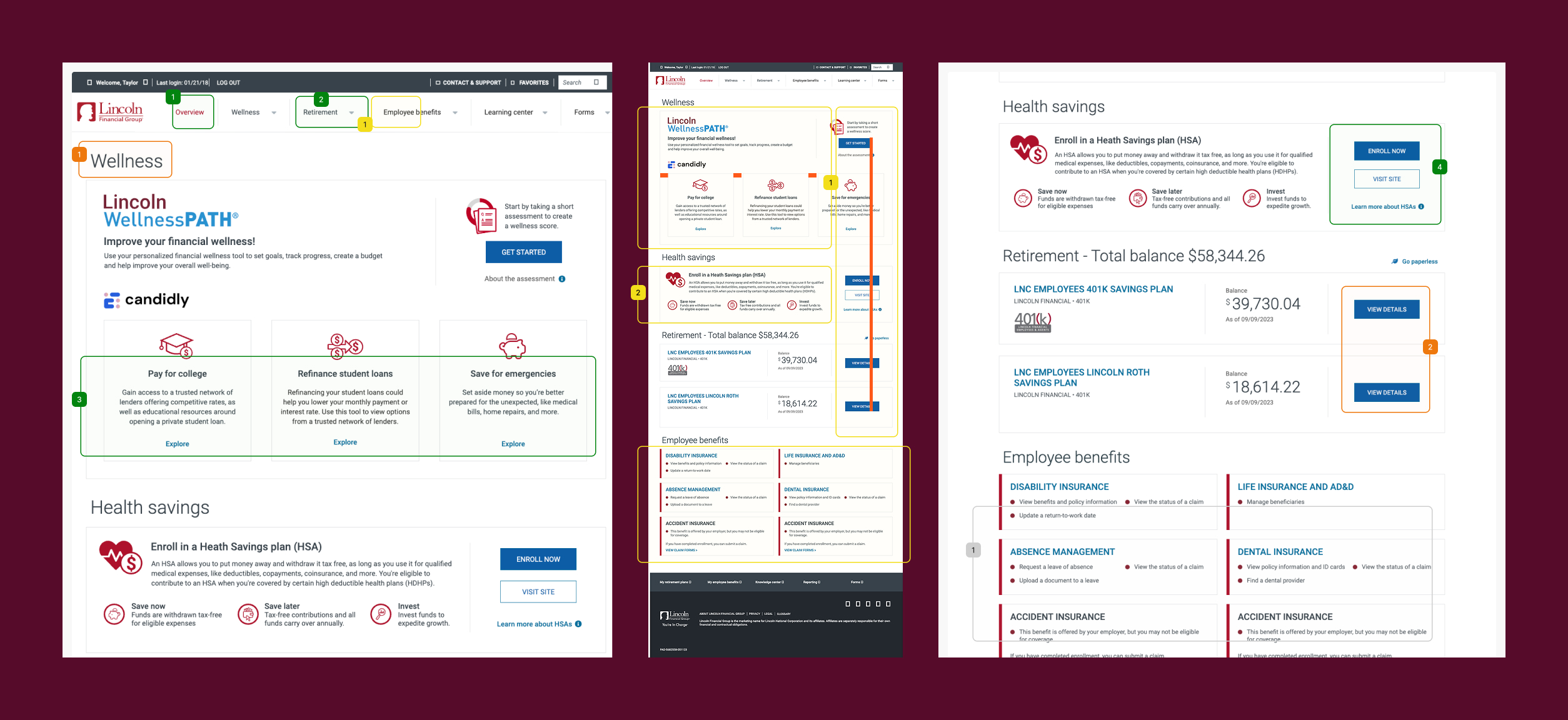
User Experience & Visual Design Audit
A UX and visual audit of the existing portal surfaced the root causes — issues that went deeper than surface-level styling and required deliberate architectural decisions to resolve.


