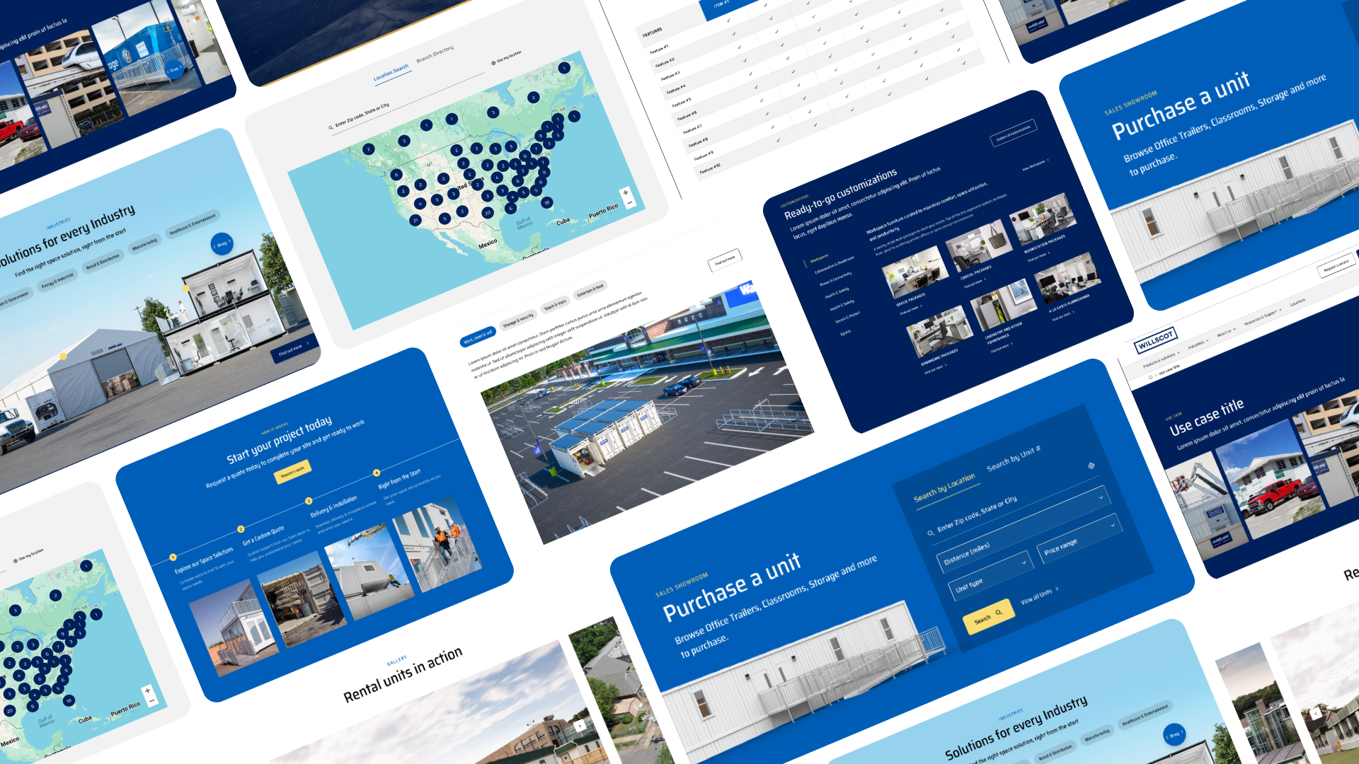
WillScot Mobile Mini had grown through acquisitions — and their digital presence showed it. We led the end-to-end redesign that consolidated eight fragmented web experiences into a single platform serving 85,000+ customers.

WillScot Mobile Mini (WSMM) is a leading provider of flexible workspace and storage solutions across the US, Canada, and Mexico — serving construction, healthcare, education, and hospitality markets from 240+ branch locations.
Following a series of acquisitions, the business found itself operating eight separate websites, each built independently with its own navigation, taxonomy, and tone. What should have been a unified brand had become a fragmented digital patchwork — and customers were feeling it.
Leadership needed a digital platform that could support lead generation at scale, consolidate operations, and position the company for continued M&A activity — without rebuilding from scratch every time
I worked on the design end-to-end, from stakeholder alignment and research through to the final handoff. We were able to deliver a streamlined architecture, improved lead generation pathways, and a cohesive brand presence across the new website.

Through stakeholder and customer interviews, I identified the structural issues behind user frustration. The problems weren't cosmetic — they were architectural.
Each acquired site had its own visual language, navigation model, and content hierarchy. Customers crossing between products had no sense of continuity.
The existing sites had limited quoting functionality and no clear conversion pathways - pushing all lead activity onto sales teams and phone calls.
Customers had no visibility into deliveries, billings, or support online. Every query required a direct touchpoint with internal teams.
Eight sites meant eight versions of similar product information scattered everywhere - often inconsistent, outdated, and costly to maintain in parallel.
Without a unified taxonomy, users couldn't compare or evaluate products across the range - resulting in confusion and drop-off at the decision stage.
My guiding principle for this project was to solve the architecture before touching the visuals. A beautiful interface on top of a broken structure just makes the problems harder to see.


These weren't the only design decisions, but they were the highest-leverage ones — each addressing a specific failure mode identified in research.
Replaced static dropdown navigation with an horizontal-scroll module using interactive pulse-point highlights to create a memorable and accessible user experience. Users could now identify relevant solutions by their own industry context rather than navigating a product taxonomy they didn't know.
Designed an interactive gallery with robust filtering and inline unit details — reducing the clicks required to evaluate a product from 6+ to under 3. Making the the process of finding and evaluating units as intuitive and efficient as possible.
Replaced an opaque contact form with a structured, step-by-step quote request — each step contextually scoped to reduce cognitive load. This created a digital lead path for the first time, reducing dependency on inbound phone calls.
Built a scalable PDP template consolidating features, dimensions, configuration options, and imagery into a single page — with expandable sections to control information density. Eliminated the multi-page navigation that previously fragmented the evaluation experience.

This project pushed me to operate at a genuinely senior level — not just as someone executing screens, but as someone shaping the strategy behind them. The biggest challenge wasn't designing individual components; it was building alignment across teams, making principled trade-offs under ambiguity, and designing a system that others could extend.